Creation and Implementation of a Design Process at Dana Incorporated
Background:![]()
The company built a new team called the Digital Business Unit to create data services for fleet customers based on telemetry data from Class 5 Battery Electric Vehicles that the company builds. The data services provided context to the data, allowing the fleet managers and fleet owners to better understand how the vehicles perform.
Business Challenge:
- The Digital Business Unit established goals to create products, but had no history of user experience design or user interface design.
- The Digital Business Unit worked with McKinsey & Company to conduct initial user research, conduct competitive analysis, and develop the primary user personas.
- The Digital Business Unit’s Product Team created user stories and use cases for the data services based on the existing data signals. This determined the technical requirements of each data service.
My Approach:
- Using the description of the data and the technical requirements of a service, I created a user journey map to illustrate the process a user would go through when interacting with the service. This allowed us to align all team members with a common understanding and foster collaboration during the development of the service.
- I developed the information architecture of a service that outlined the structure and hierarchy of the content. This also mapped out user flows to visualize the potential paths users would take through the service.
- With a completed user journey map and information architecture, I translated the user’s interaction with the service into a visual storyboard. This translated the complex ideas and concepts into clear and distinct steps the user would take.
- I developed low-fidelity wireframes to establish the layout and basic functionality.
- I designed data visualizations that displayed the signal data to flesh out the previously created narrative. These visualizations incorporated additional data (e.g., temperature, weather, traffic, elevation, etc.) from other sources to develop a more comprehensive context for the signal data.
- I built prototypes that combined the data visualizations with the wireframes and simulated user interactions. The prototypes also featured descriptions of what each user interaction would include and notes that explained to developers what criteria constituted that the service was successfully built.
- I conducted design reviews after creating each of the artifacts. This resulted in an iterative process informed by feedback from all internal stakeholders.
- I also engaged selected fleet customers as partners to ensure that the services we were building would provide value. At several points in the design process, I presented the revised artifacts to the fleet customers to verify that the trajectory of the designs remained useful and meaningful. The artifacts went through additional iterations when feedback from the fleet customers warranted them.
- I designed the data services to be displayed within whichever fleet management system that the customer was using, to provide seamless access to the Dana data services in their existing ecosystem. This required me to communicate with designers and developers from each of the fleet management system providers to negotiate how the Dana services would appear and function.
All the artifacts mentioned above include propriety information and I am legally unable to display them. This describes the design process I created and implemented as the Senior User Experience and User Interface Designer at Dana Incorporated.
Design of Dynamic Content for Internet2 Website
Business Challenge:
- The company website was redesigned and migrated to the WordPress platform.
- Several pages included content stored in the company’s Customer Relationship Management platform (Salesforce).
- The content was transferred to a MariaDB database where it was formatted for publication on the company website.
My Approach:
- I conducted interviews with users who agreed to participate in our website redesign process, and I asked them about their preferences in interacting with long lists of data.
- The majority of the twelve users interviewed stated that a way to filter by type of member would be very important.
- Several users requested a way to jump to a particular letter of the alphabet to display members whose names began with that letter.
- Nearly all of the users requested a search box also.
I took these comments into consideration as I designed the interface. I incorporated all three elements in the wireframe I created to demonstrate how we would display the member content. I also provided the structure of data that would be pulled from the database.
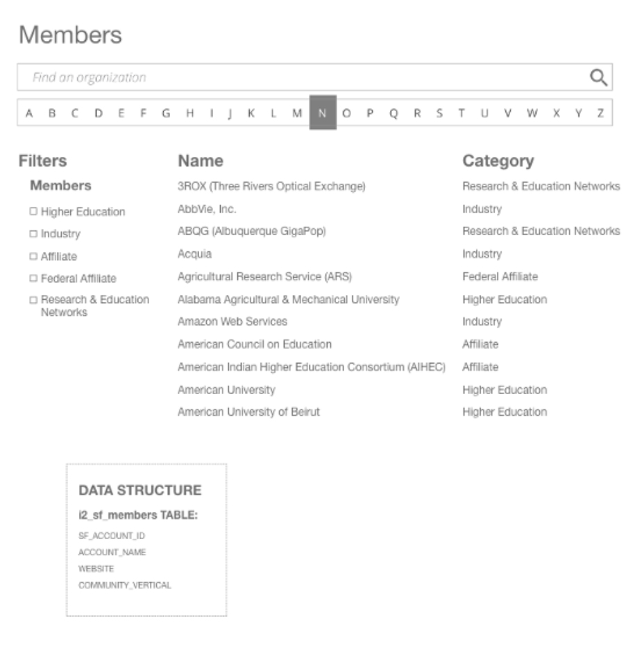
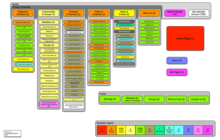
Diagram of the Internet2 Website by Page Template
Business Challenge:
- The company website framework was created to encourage a distributed model of content creation.
- The company’s implementation of the Django content management system included 12 different page templates that were all new to the content creators.
- Content Creators needed to be able to know which page template to use for which individual piece of content.
My Approach:
- I consulted the website’s sitemap and the list of the templates available.
- For each section of the site, I determined the appropriate page template for each level of content within the section.
- I used OmniGraffle to create a diagram that visually displayed a map of the website, listing each type of page and its corresponding page template.
This diagram evolved as new types of content and new page templates were created. It allowed a greater level of autonomy for all content creators, as they could identify the appropriate page template for any page they needed to create. They based their decision on the location of the page within the hierarchy of the website and which existing pages were similar in style and function to their new page.
Redesign of Internet2 Service Catalog
Business Challenge:
- The company website was designed without actual user research and decisions reflected the “gut feeling” of the product manager.
- Negative user feedback and analysis of traffic to and through the service catalog confirmed that the interface did not include information that users needed.
- Users did not understand how to use the elements programmed into the interface (i.e., Type and Phase).

My Approach:
- I asked users open-ended questions about the elements of the interface that they did not like or did not understand.
- I also asked them what types of information would help them in completing their task when using this interface.
- The feedback I received from users informed me that:
- They found the grid of acronyms that they did not know (TYPES) and the icons that they did not understand (PHASES) confusing.
- This information did not help them to make decisions about which service was the one about which they wanted to learn.
- No one realized that the text of the acronyms and the icons were clickable and would change which items would be listed in the display.
- I reviewed the traffic data for the page and the data confirmed that less than 1% of all users clicked on links other than the names of the services once they arrived at the catalog.
- I also determined that the most frequent path that users followed went from the catalog page to a service page then back to the catalog page and to another service page.
- This pattern made me suspect that users were unsure of which service was the one about which they wanted to learn.
- As for information that they wanted to help them choose one service versus another, almost unanimously the users requested descriptions of the services.
Based on this feedback and the data analysis, I concluded that a better user interface would remove the elements that confused the users and were not used and include content that would assist users to make more informed decisions. I chose to display the service names and descriptions that both included links to pages that each contained specific details about individual services.

Redesign and Rebranding of the University of Michigan Library Website
Business Challenge:
I was hired as part of a web team to create a single web presence that would replace the 20 individual library websites. At the outset, we were tasked with the following guidelines:
- Create a search interface that would be “like Google” but include all of the library system’s resources.
- Redesign the homepage of the library system, as it had become a somewhat random collection of links and had never been truly redesigned from when it was created in 1994.
- Provide some hierarchy or other visual cues to inform users which links are more important than any others, as user feedback suggested that users had difficulty determining what was important and there was nothing visually appealing about the page.

My Approach:
I determined that our team needed more information from our intended users. To begin collecting information about which direction we should take in our design, I chose two methods:
- I facilitated focus groups of faculty members, staff members, graduate students and undergraduate students, asking a series of open-ended questions that challenged the people in each of the groups to identify the primary reason they used the library website and what elements of a website would help them in their search for information from the library.
- I conducted a single question survey that randomly appeared for users when they came to the library website’s homepage. It asked users to briefly tell us why they had come to the library website. To encourage participation, we made the survey appear every tenth time that the page loaded and only made it appear for two consecutive days at a time.
With the information from the focus groups and the survey, I identified that the library’s users wanted a search function that would allow them some flexibility.
- Some asked for a single “Google-like” search box.
- Some wanted separate search boxes for each of the different types of information available to them (databases, journal articles, library catalog and website).
- Some wanted to be able to browse resources by subject area and not search at all.
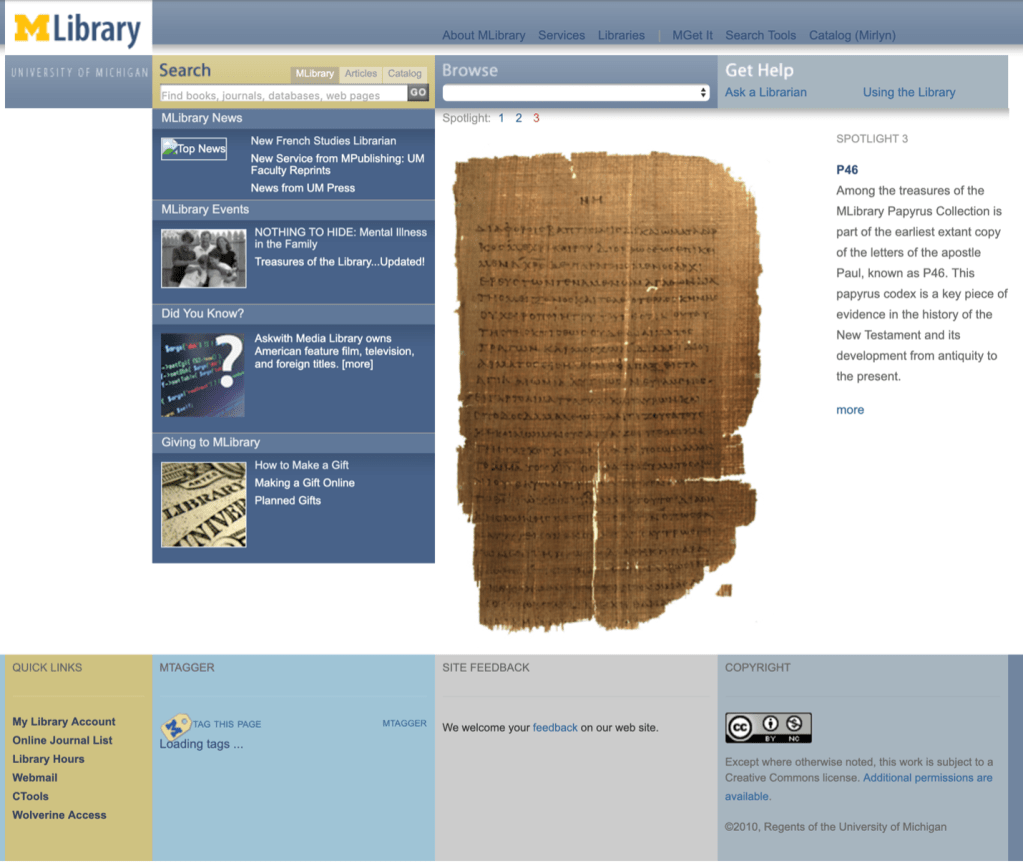
Armed with this information, I worked with programmers to identify what was technically possible. I created the requirements and designed a user interface that established priority for search and included access to a variety of the resources our users had requested. The search included tabs for three different types of searches, one that included the library catalog, the collection of electronic journals, the collection of databases, the library website, and the university’s institutional repository.

The second tab was a keyword search of library databases narrowed by a general subject.

The third tab was a search of the library catalog that allowed a user to determine the type of search they wanted to perform.

Once I created initial designs of the search possibilities, I combined them with an interface for browsing for information by the library’s general subject classifications and a method for users to request assistance from a librarian. This formed the top tier of information on the new library homepage. Secondary information that I added to the library homepage came from a survey of library staff. It included news about the library, a list of events occurring at the library, a random trivial fact about the library or its collections, and a set of links related to donating to the library. Our web team decided that we wanted to incorporate a large, visual element to the homepage, so we identified a number of treasured items from the library collections to feature as Spotlights on the homepage.
Before the site was built, I created a low-fidelity paper prototype of the design and conducted some quick, “guerilla” user testing.
- I approached students and faculty members in the library or outside on the Diag with the prototype and asked them a few questions about the interface.
- I tried to determine if they understood how the various search options would work and asked basic questions about where they expected to find particular information (e.g., When is the library building open?).
Once we determined that the design seemed to work for those initial users, the site was built out completely. At several points during the construction of the site, I facilitated task-based user testing.
- I scripted a series of tasks that we asked users to try to complete.
- I sat with the users we recruited and asked them questions about what they thought and how they found the interface.
The combination of guerilla testing with the paper prototype and the task-based usability testing allowed us to confirm that the new design would meet the information needs of our users.
Redesigning the Website of the Sheridan Libraries of Johns Hopkins University
Business Challenge:
I was hired to manage the design and development of the libraries’ website. There were several issues related to the existing design that made the website less than satisfying or useful for library users.
- The existing website was designed by the library staff without user input.
- It introduced a paradigm regarding labelling the groups of information “Find It, Get It and Use It.” User feedback informed me that they found the paradigm confusing.

I received feedback from users via a Contact Us web form and in person at the library reference desk. The most frequently voiced concern was that if a user found a resource, they would already have it, so why would they need to get it. Users could not get past the labels of the groups of information and were so distracted by them that they often would ask about resources that were listed on the homepage without seeing them displayed there.
My Approach:
I decided that the best way to move forward was to engage our users to help the direction of the new design. I did this by creating and distributing a survey to the faculty, staff and students of the university community. The survey included:
- open-ended questions that allowed users to type free text as their responses that provided insight into their intended uses of the website.
- a list of the resources available to them (with descriptions of each resource) so each user could rank them in order of the highest to lowest priority.
- a chance to provide their contact information in case I needed to ask them follow-up questions about their responses.
The survey results provided invaluable information that allowed me to determine the types of information users looked for on the website. I created a report of the survey results to share with library staff members. This allowed us to identify which materials users identified as most important.
- I created a conceptual blueprint for the new website and a wireframe to translate navigation options on the homepage.
- From the wireframe, I built a clickable prototype of the new homepage that I shared with users to receive feedback.
User feedback suggested that users were unsure of how the resources were grouped on the homepage, so I conducted a series of online card sorting exercises.
- Participants viewed a list of resources (including descriptions of each of the resources).
- They sorted the cards into groups and provided a label for each group of resources.
Analysis of this data allowed me to adjust the prototype of the homepage and build a fully functioning interface that would allow for task-based usability testing. Usability testing confirmed that test participants were able to complete tasks in the new interface, so we were able to develop and launch the new website.

